How we built an ultimate second brain for developers
We started building Acreom in 2022 with the goal of creating a powerful productivity application for developers, packed with advanced features. We had successes and failures along the way. Most importantly, we delivered a solid product loved by many users across all platforms, all with a team of just five people. In this case study, I want to share some parts of our design process and the lessons we learned that no one prepared us for.

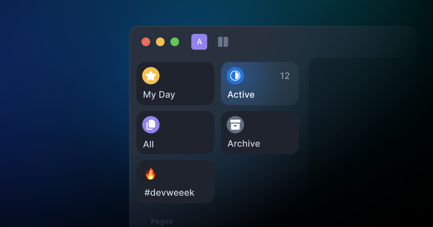
From top left: 1. The Acreom icon, 2. The onboarding flow on desktop, 3. Glass material dropdowns, and 4. The app's main navigation detail.
From web to desktop and mobile
We built the first version of Acreom for the web. Moving it to the desktop brought challenges, but it was crucial for keeping it personal and fully private.
The first version of Acreom was built for the web. Bringing it to the desktop brought new challenges, but it was essential for full privacy.
The first version of Acreom was built for the web. Bringing it to the desktop brought new challenges, but it was essential for full privacy.
The first version of Acreom was built for the web. Bringing it to the desktop brought new challenges, but it was essential for full privacy.
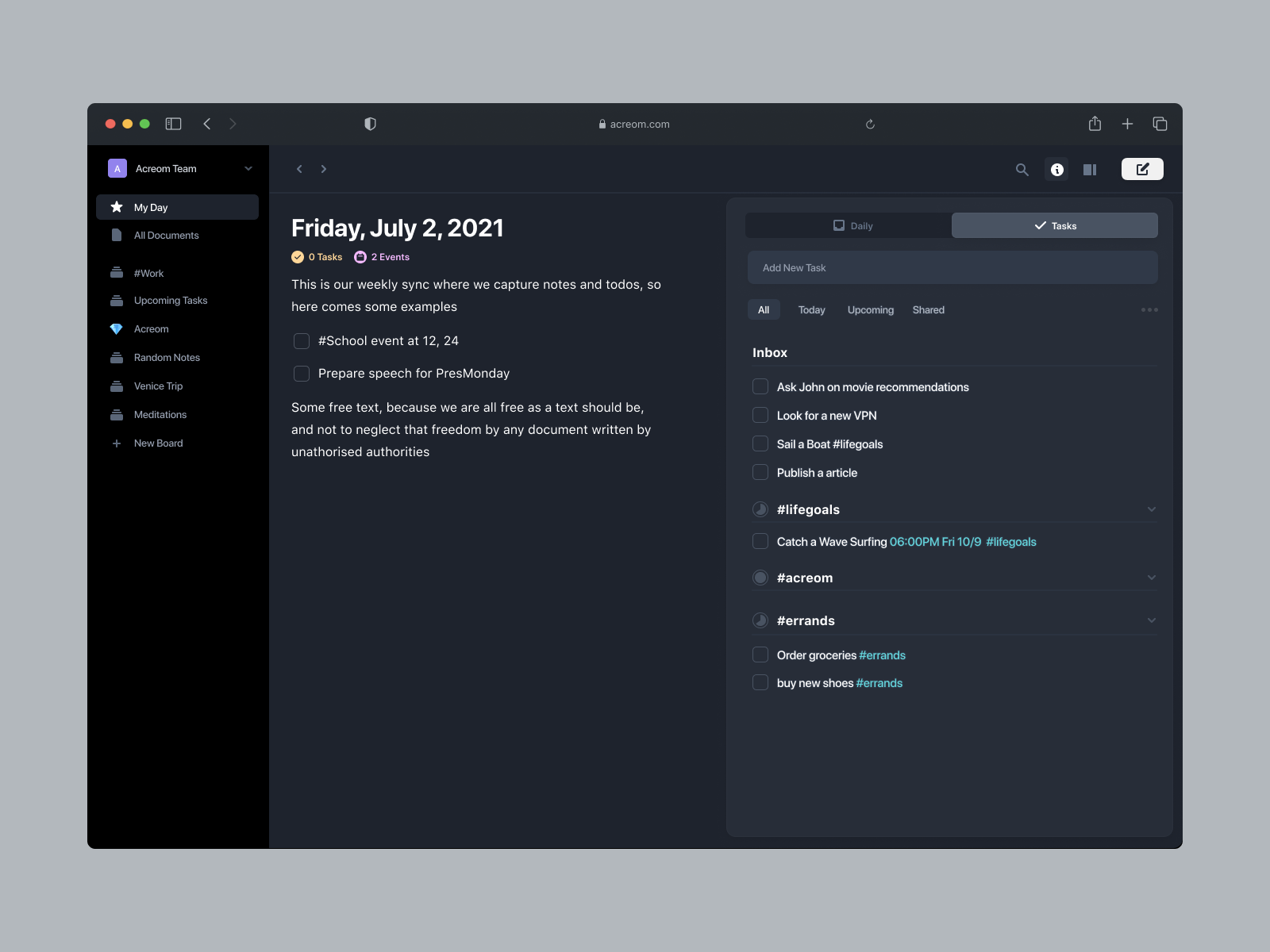
Early web version of acreom.
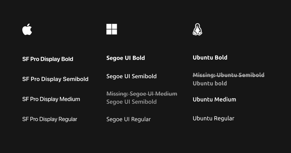
1. System fonts vary across platforms
We initially wanted to use System UI for the app. But Linux doesn't support semibold, and Segoe UI looked bland. So, we chose the Inter font for compatibility and a unified look across all operating systems.
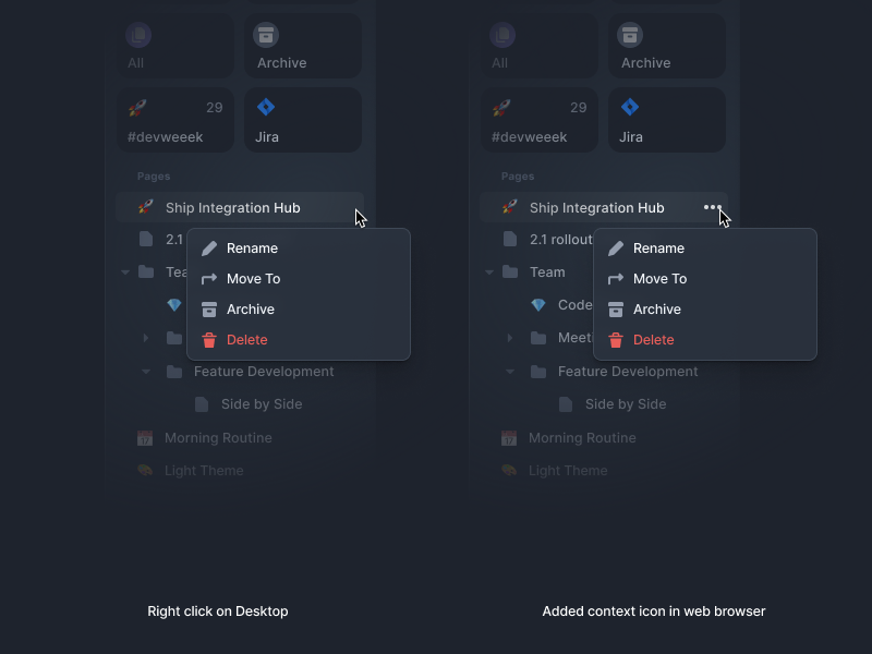
2. Right-click doesn't work on the web
Right-clicking in the desktop app opens a menu, but on the web, the browser has its own menu. So, we added a dropdown menu on the website to keep the experience consistent.
3. Navigating header differences across OS
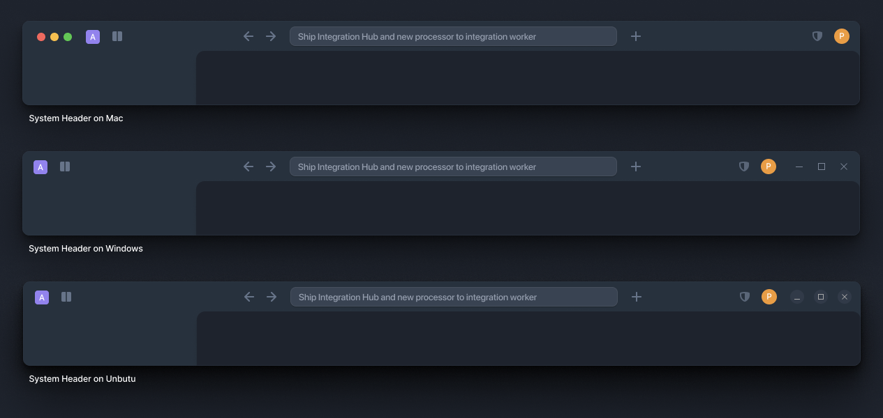
Each desktop app has a draggable header, and there are different ways to handle it. The Mac app header has traffic lights on the left, while the Windows and Linux versions have window controls on the right side. We designed the header to blend in smoothly without adding an extra layer of navigation.
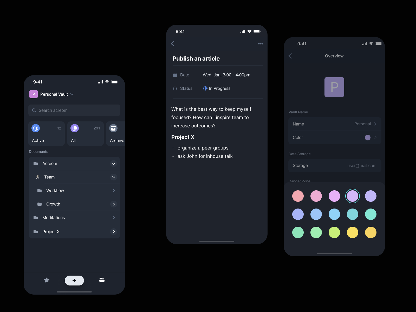
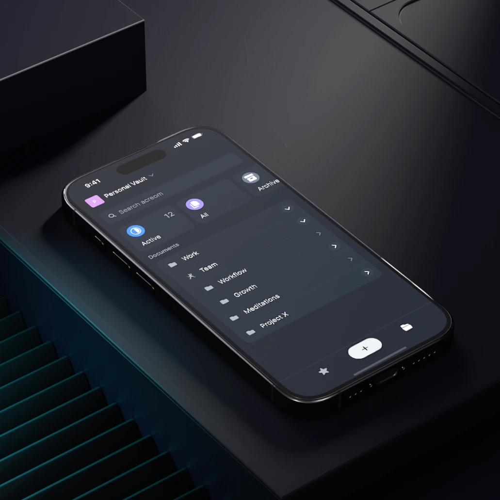
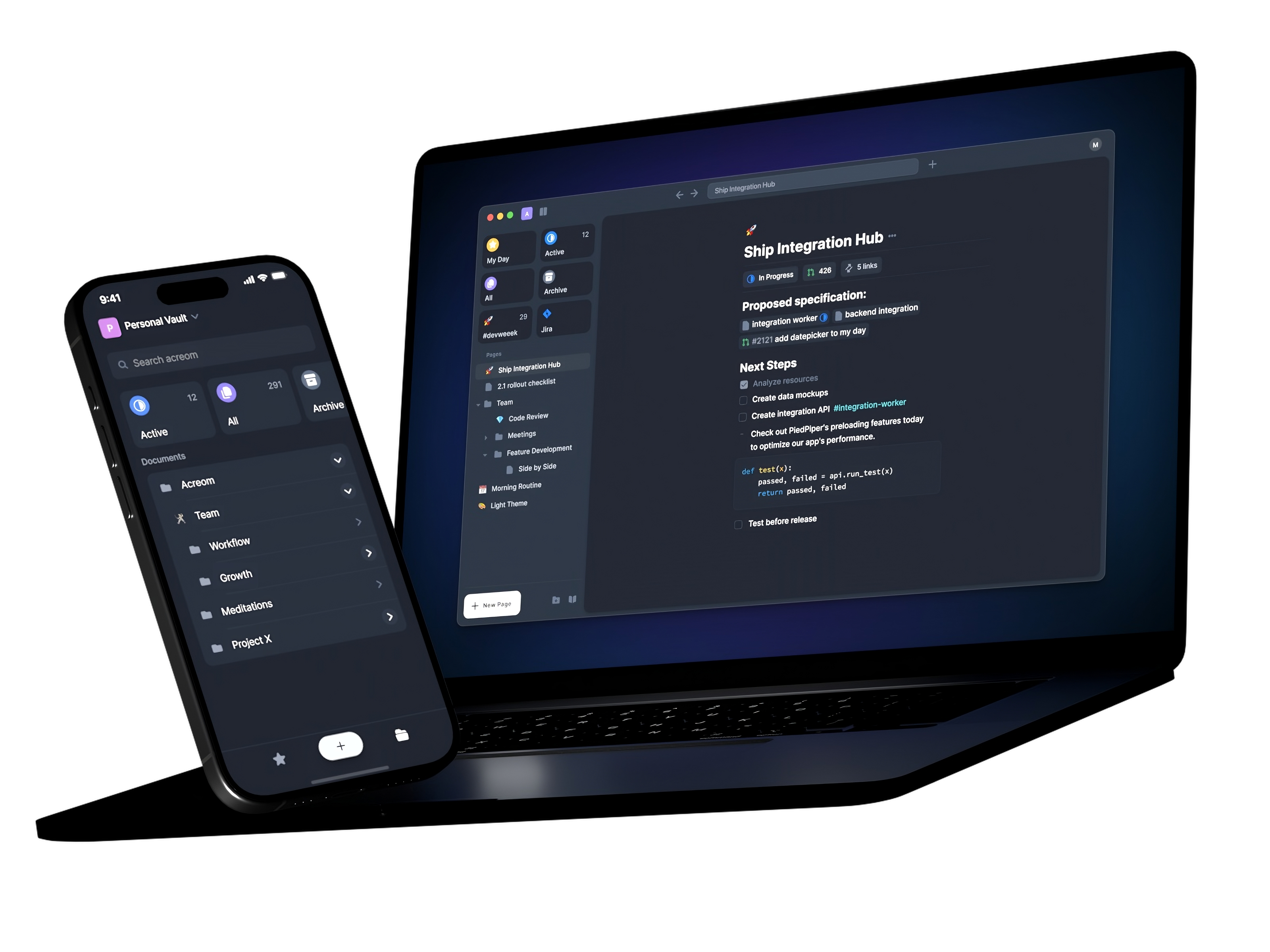
From top left: 1. Mobile app screens, 2. 3D render preview, 3. Compose button interaction design.
Turning text to actionable tasks
In Acreom, tasks are part of text files. We wanted tasks with dates to appear on the right day with all the details. To achieve this, we used checkboxes to distinguish tasks from notes.
There are different ways to handle tasks with due dates: component-based or inline-based. Both methods have their pros and cons. Let's explore them in detail.
Component vs Inline based tasks
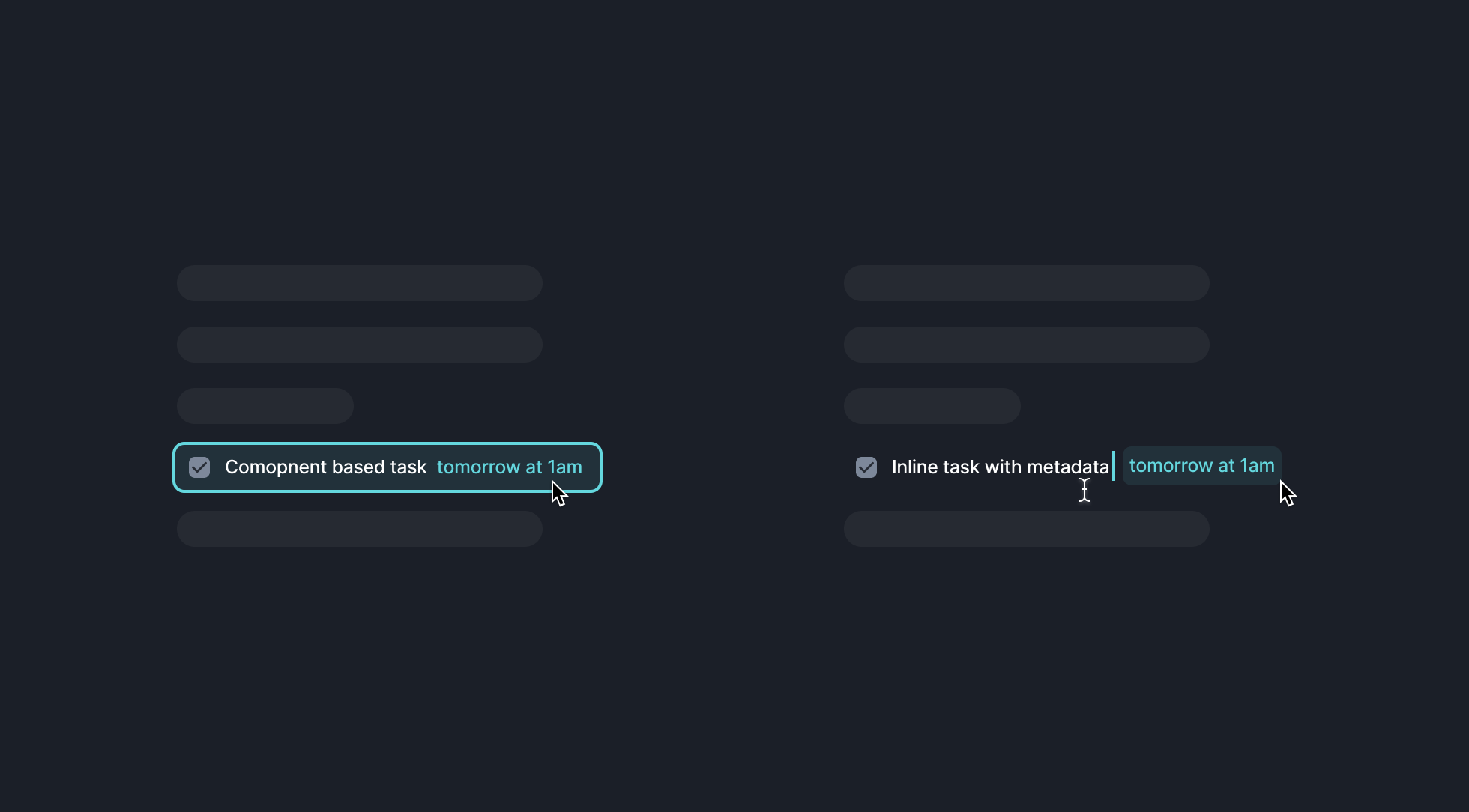
Component-based tasks provide a better grasp of the entity, making it easier to navigate back to them and view their details. However, you can't nest or write context around them, which simplifies their use. Every time you open a component-based task, you see the details inside, not floating in the text.
Inline-based tasks are easy to capture and access with the keyboard. However, pulling them outside of the document can feel disconnected from the context.
There is no ultimate solution as both have their pros and cons. We've found that developers prefer inline tasks with metadata because of keyboard accessibility, although this approach can make it harder to locate tasks from other parts of the app because you are referencing the plain text.
To streamline this task creation, we built in NLP which detects actionable words and sentences that might look like tasks. For better understanding our approach read my blog post 5 Steps to Design a Better Machine Learning User Experience
Our goal was to make it magical, proactive & non-intrusive.
Since users focus on the blinking cursor when writing, we created an underline effect to draw attention to what's happening. We designed for an audience writing left to right, so we chose a non-destructive prompt location at the bottom right of the screen. To make it even more intuitive, we created a strong and familiar shortcut to confirm tasks (cmd + enter on mac, ctrl + enter on windows and linux), allowing power users to gain value quickly and consistently.
ML models can sometimes be wrong, so if you continue writing, the actionable notification will simply disappear after few seconds.
Boosting productivity with modular tabs
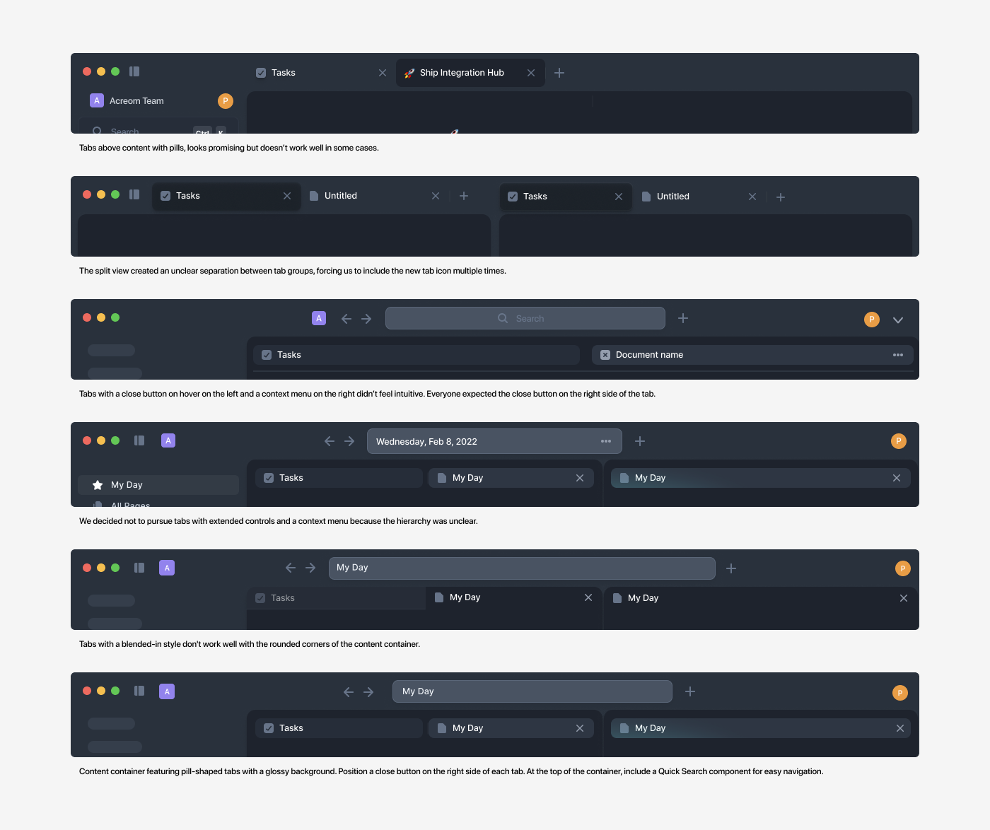
To make acreom more powerful we've built tabs for multiple pages with side-by-side support. Imagine you are on meeting. You have prepared notes to discuss, and have captured notes to write. If you've ever tried to do it in single document, you know how annoying is to scroll back to the top every time to check what needs to be discussed and what actions will be taken. We've built tabs for that.

We’ve built more than 10 various prototypes in Figma exploring feel of each version and built 3 of them. Then multiple beta builds to create great feel. You can read more about technical aspect of it on to read more check How We Built Modular Tab System with Side by Side View.

Bringing in 3rd party apps
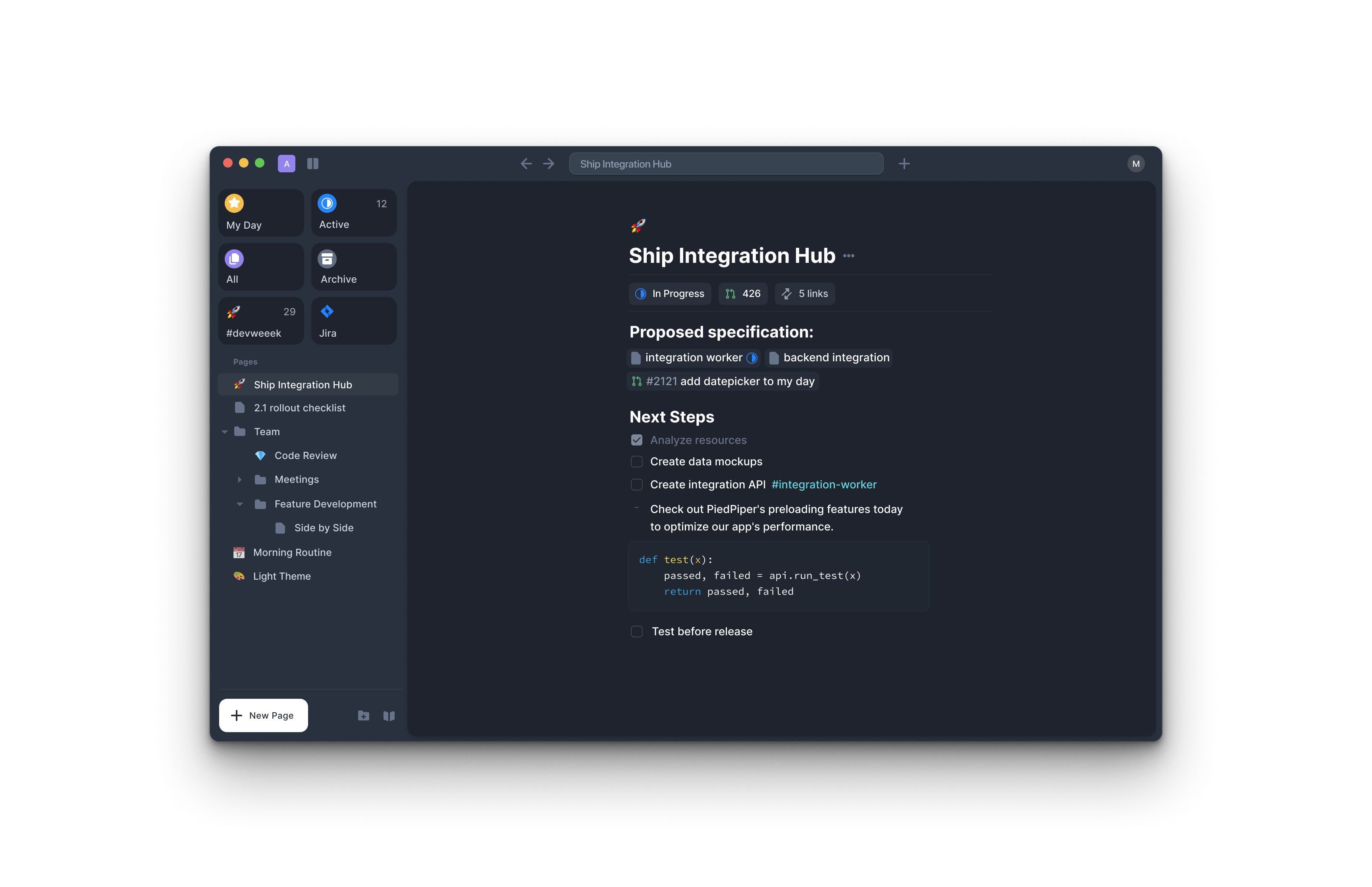
A powerful note-taking experience brings scattered context into one place. Bridging this with tools was natural for us. But where to draw the line? How much should you support 3rd party apps? What if there's a technical problem and they don't work? Would your app be useless?
There is a point of confusion when offering controls for 3rd party entities that have similar attributes to your own. This can create a mess. For example, if you bring in a Jira entity with a Due Date and also have a Due Date for your tasks, the user sees two Due Dates, which is very confusing.
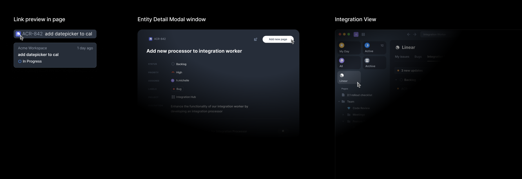
This is why many products avoid such integration. We learned this the hard way. Our solution was to minimize controls for 3rd party entities, showing only basic options like "Open Origin" and "Add to acreom page."
These entities also have their own detail modal window. This adds a bit of friction for users who want to quickly view the data, but it creates a clear, controlled environment for managing a single entity, which we found more important.
We also created an Integration view to display 3rd party entities.
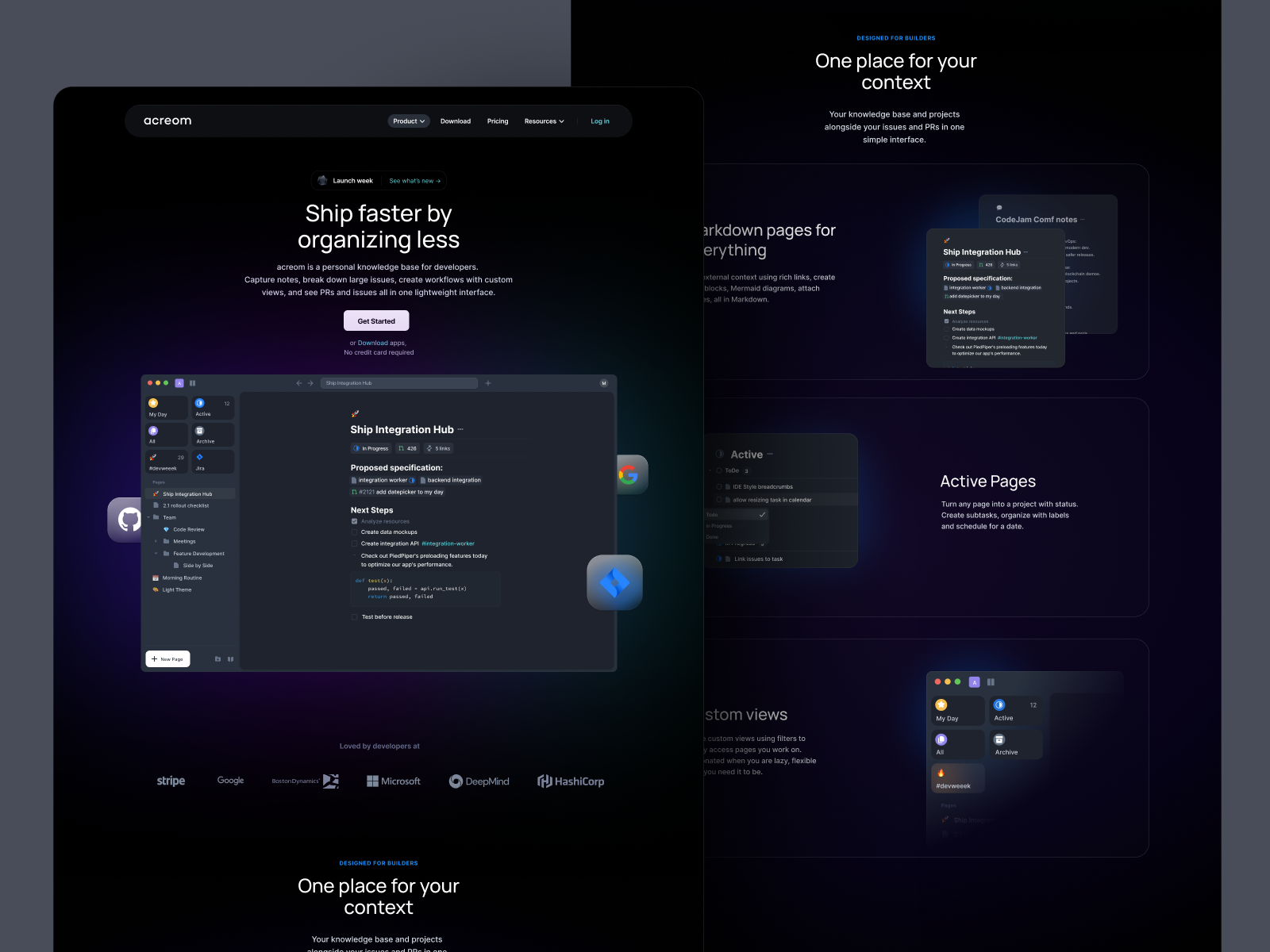

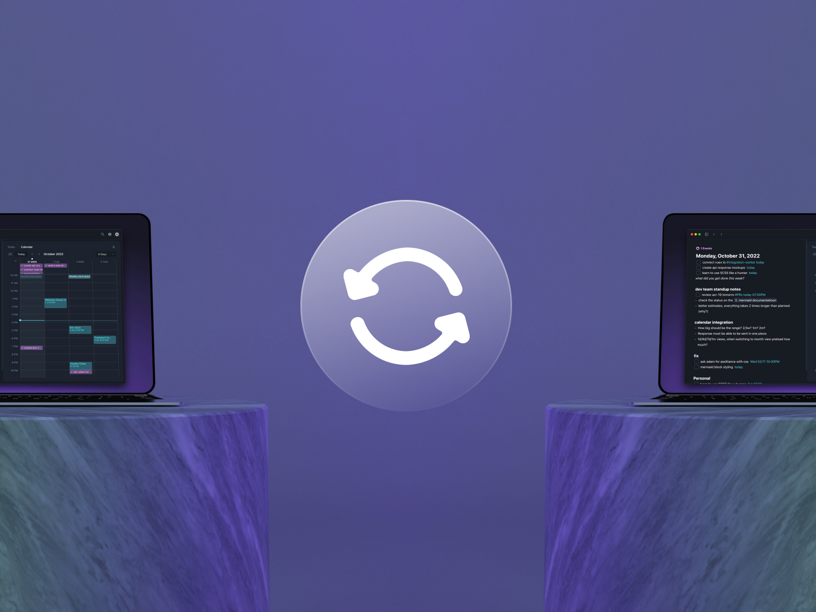
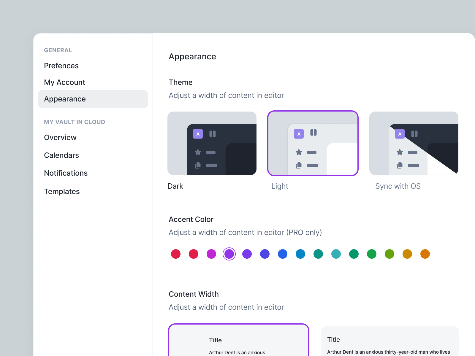
From top left: 1. acreom website 2. Pattern made of glass objects and lights used in marketing materials 3. Encryption introduction video 4. Visual for annoucing sync improvement 5. Icon animation created for marketing campaign 6. acreom apperance settings page
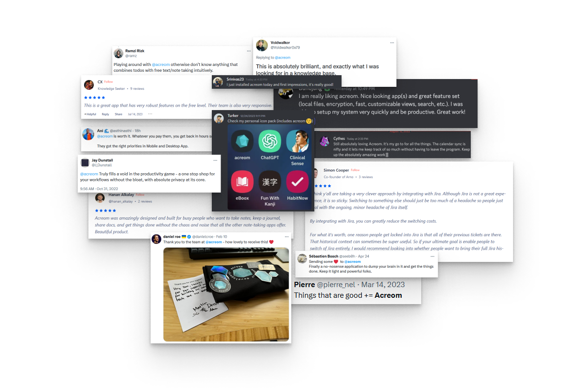
@ramz
Playing around with @acreom otherwise don’t know anything that combines todos with free text/note taking intuitively.
@dstewart1017
Got to say it is @acreom. I have no connection to the project, I just use it regularly. It is nice enough that I have dropped notion.
@SyedAsifSultan
With Acreom, you can finally get everything together in one place. Forget about endless email chains & out-of-sync documents - all information is in one single tool for your workflow.
