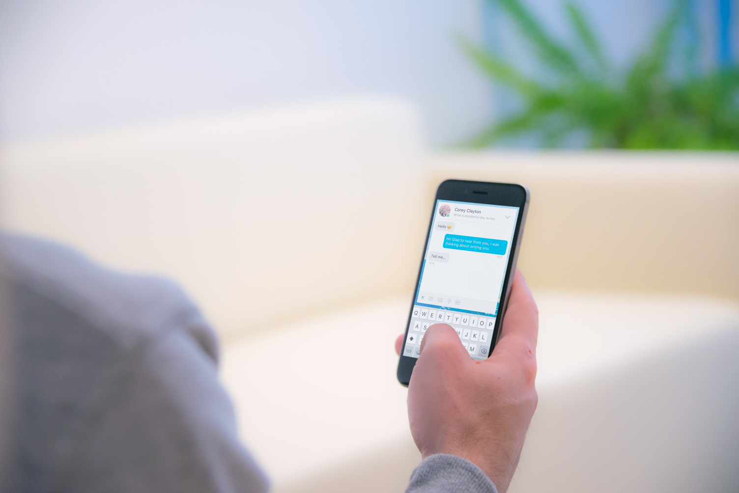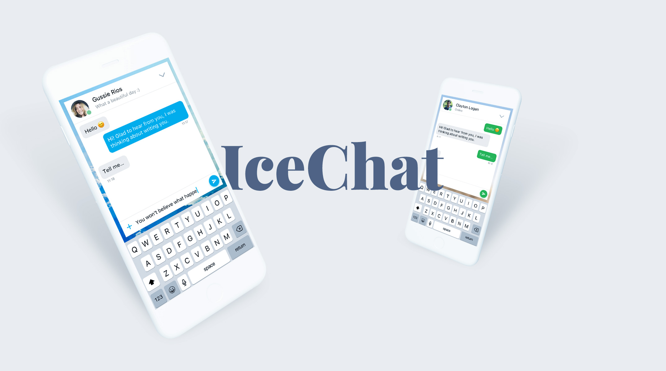
IceChat is a mobile chat application by IceWarp - a powerful productivity platform used by 50 million end-users worldwide. In a collaboration development studio MOfA, I designed an iOS application.
— Prototyping
— UI Design
— Interaction Design
— Prototyping
— UI Design
— Interaction Design
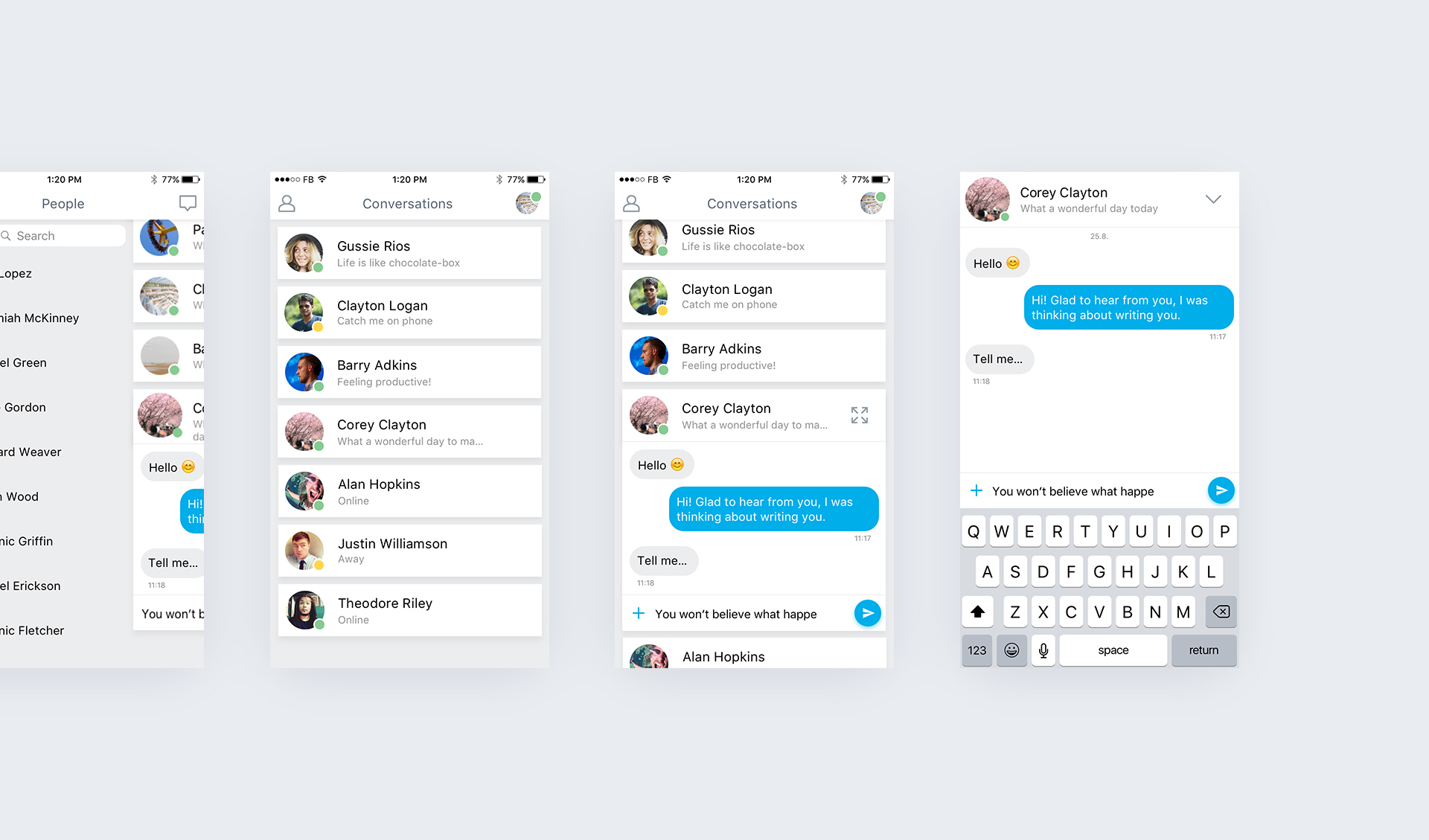
When I joined the project, the application was already in a functional state, but it needed a new visual. We have designed the first version with a new visual within a few weeks and put it into interactive clickable prototype. When presenting somebody was joking I developed the whole app. This high-fidelity interactive prototype allowed us to focus on the project end-state. After collecting the feedback we have moved towards next iterations.
Personal touch by design
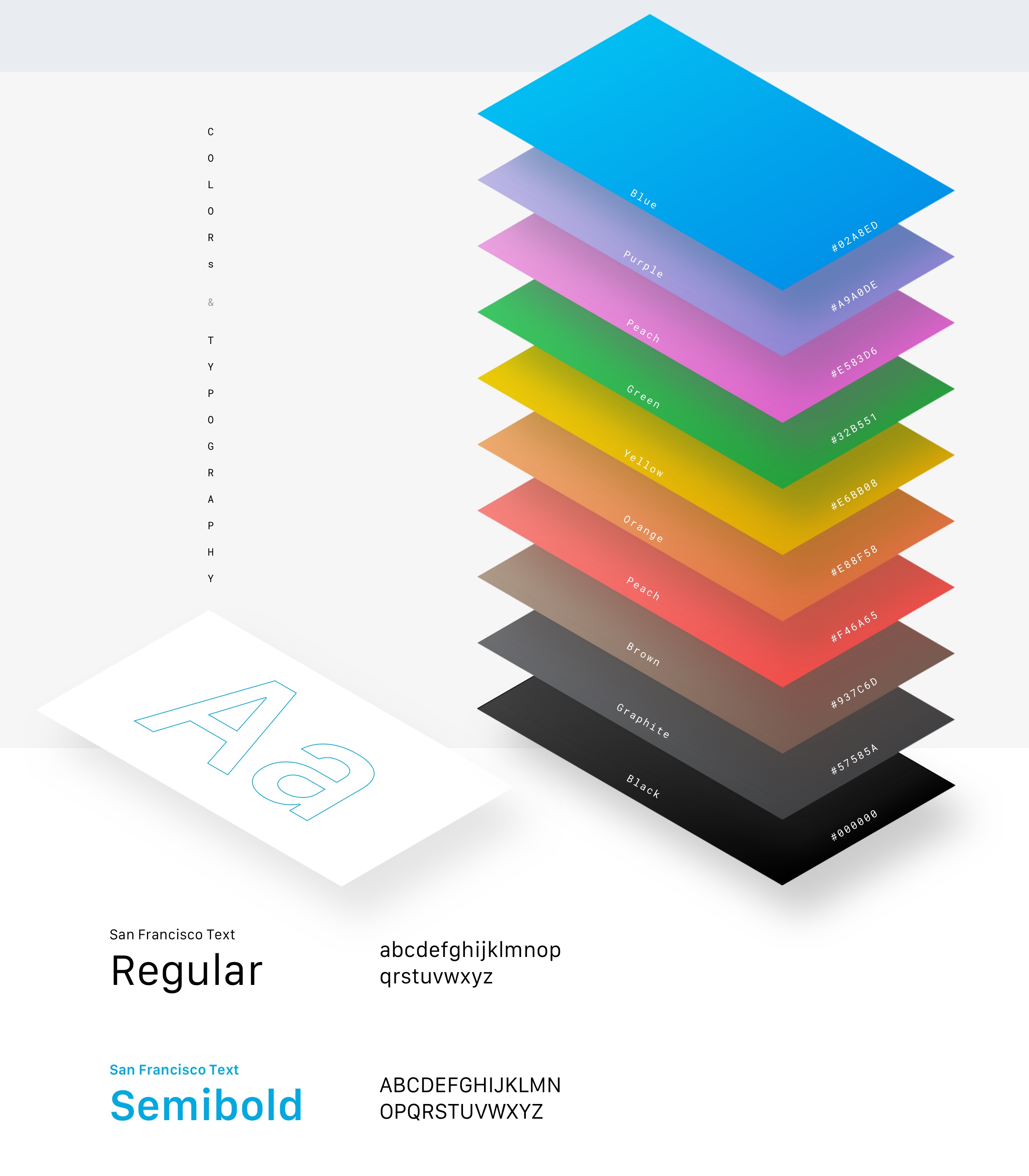
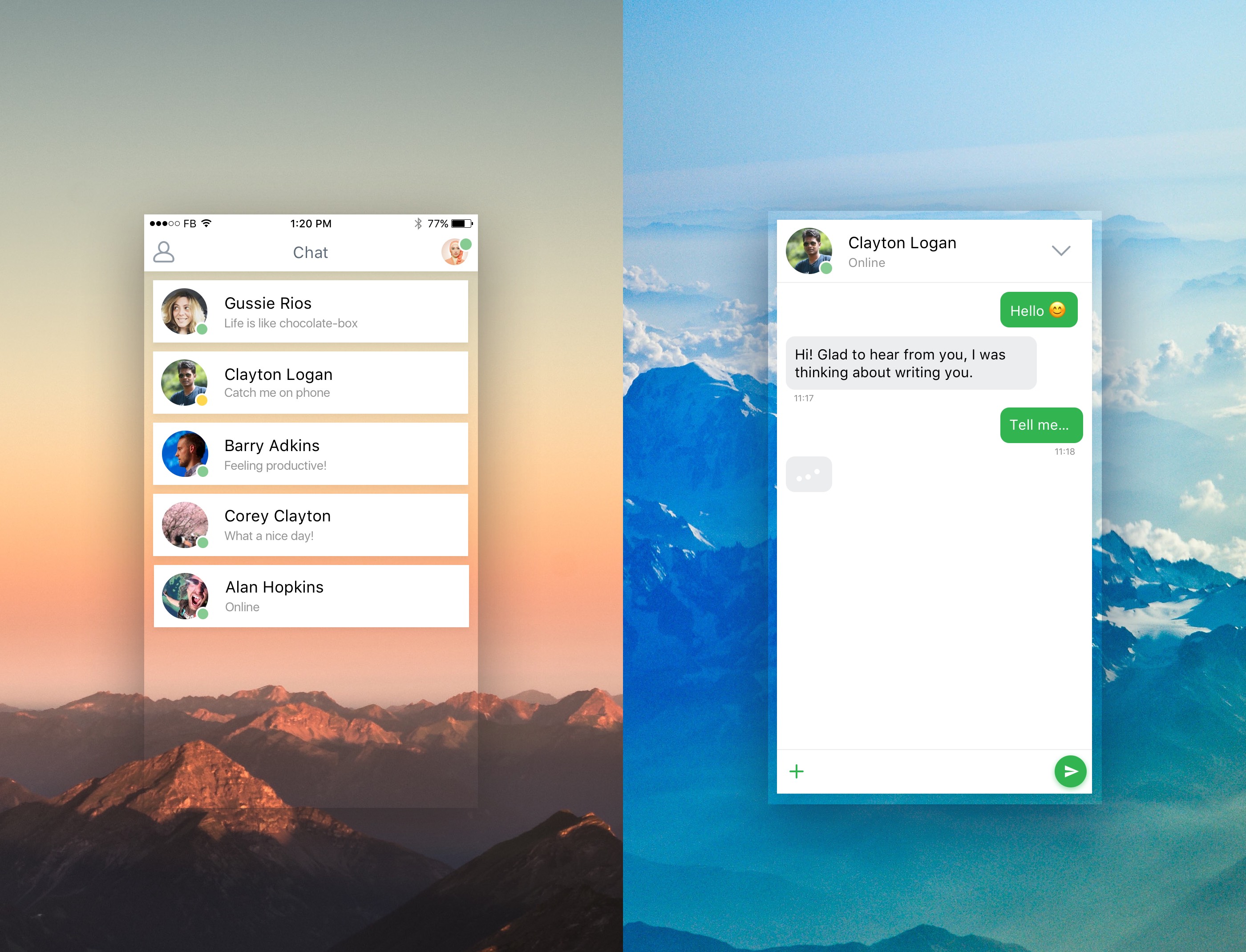
To make it personal for users we designed the interface to be highly customizable. Users can select a custom background image and chat colors. Colors were already used in the web application, so we adopted them with respect to mobile conditions. People often use their phones on the sunlight and shaky environment. Low contrast slows them down and makes the application harder to use. This is why we came with high contrast colors. We have tested it in multiple edge-cases scenarios to make sure it's working in various user settings.
Making interactions flow
Mobile applications provide rich space for various micro-interactions and animations. Having designed screens in place allowed us to move to identify animation opportunities to improve the user experience. We have animated transitions between chat and contacts screen, chat input interaction and some other elements are animated to make the application feel smooth.
Going to the store
At the beginning the project launch was questionable. The client managed to successfully launch and an IceChat An application is now in the App Store and free to use for all existing IceWarp customers.
